Signal
The design system behind this site, every piece of it live, and the decisions that shaped it.
- Stack
- CSS custom properties, Astro components, Satori
- --bg
- --surface
- --fg
- --muted
- --line
- --accent
The palette, read live from the page: switch the theme in the footer and the chips and their values follow.
The brief was a site that reads like a well-instrumented system: understated, quiet type, generous space, with the interest in the details. Showing off a little, never on the nose. This page is the system itself, using the same components as the rest of the site rather than pictures of them.
Decisions
One accent, rationed
The palette is called Verdigris, after the green of oxidized copper. It was chosen over three alternatives (an oxblood, an amber phosphor and an international orange) because it’s uncommon on developer sites and calm without being bland. Most of its effect comes from the neutrals: every gray leans slightly toward the accent, so the page has a temperature before any color appears.
The accent itself is rationed to links, the current page, live readouts and status. Everything else is ink and paper.
| Token | Light | Dark | Contrast |
|---|---|---|---|
--fg |
#152019 |
#e2e9e5 |
14.4 / 15.1 |
--muted |
#5d6a64 |
#88968f |
4.8 / 6.0 |
--accent |
#22695a |
#6cc3ad |
5.6 / 8.9 |
Contrast is light / dark, against each theme’s background. Every text color clears WCAG AA (4.5:1) in both themes. The theme follows the system unless you choose otherwise in the footer, and a choice is applied before the first paint, so the page never flashes the wrong one.
Two typefaces with different jobs
Schibsted Grotesk sets everything you read. IBM Plex Mono sets everything you scan: labels, numbers, dates, readouts. The split is what makes a spec sheet or an index read like an instrument panel without any ornament. Both are self-hosted, and the text face is preloaded, so text never jumps when the real font arrives.
Section label · instrument caps
Lists, not cards
Work is an index, not a grid of tiles. A numbered row with a one-line summary and a tag lets you compare the whole list at a glance, and it doesn’t pretend every project needs a thumbnail. This is the live Work index:
- 01Synthetic monitoring for bbb.orgProbes that act like real users on production found a defect that had silently broken 2.8% of page renders for more than a year, and dashboards that had stayed green through real outages.
- 02AutoLightA machine-learning desktop app that learns a photographer's editing style from their Lightroom catalogs, and delivers it back into Lightroom. Designed and built solo.
- 03Retiring a legacy data pipelineMoved bbb.org's business profiles off a fragile push pipeline in two stages, from Solr to Postgres and then to an event-driven connector, with shadow runs, flag-based cutovers and a repair job instead of a big-bang switch.
Lead with a picture
Every case study opens with its most telling figure, right under the spec sheet, and every lab entry opens with its experiment, as this one does. A visitor should see the thing before reading about it. Figures number themselves, and diagrams are drawn in the page’s own tokens, so they follow the theme too.
Details that reward a closer look
- The footer stamps every page with the commit it was built from, linked to GitHub.
- Lab status is a shape as well as a word: live in progress archived
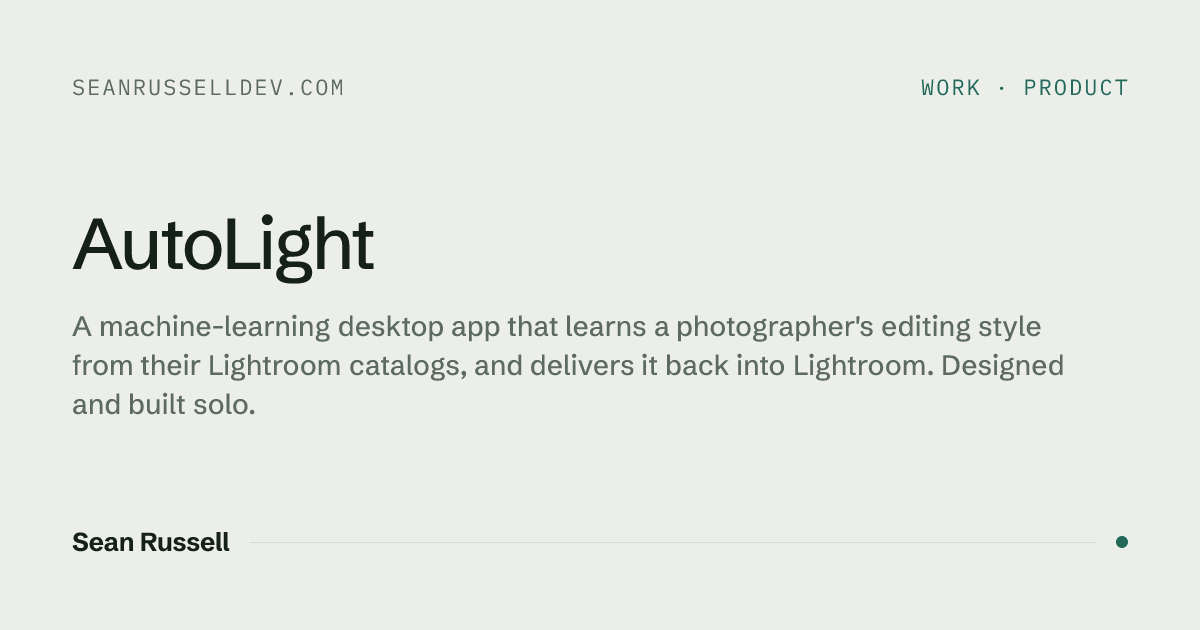
- Link previews are rendered at build from the same fonts and tokens, one per page (Fig. 01).
- The home page will carry a live latency and uptime readout once the probe that feeds it exists. Until then it only appears here, clearly marked as example data:
Constraints it holds to
- accessibility score on every page (Lighthouse, mobile)
- 100
- layout shift on every page
- 0
- every page checked at phone width, in both themes
- 375 px
The spec sheet is the same component the case studies use:
- Typefaces
- Schibsted Grotesk, IBM Plex Mono
- Palette
- Verdigris, light and dark
- Built with
- CSS custom properties, Astro components
The script that applies a saved theme before the first paint is small enough to show whole. It sits in
every page’s <head>:
(function () {
  function apply() {
    try {
      var t = localStorage.getItem('theme');
      if (t === 'light' || t === 'dark') document.documentElement.dataset.theme = t;
    } catch (e) {}
  }
  apply();
  document.addEventListener('astro:after-swap', apply);
})();
Understated, showing off a bit, never on the nose.
That was the whole brief, and it’s still the test for anything new on the site.